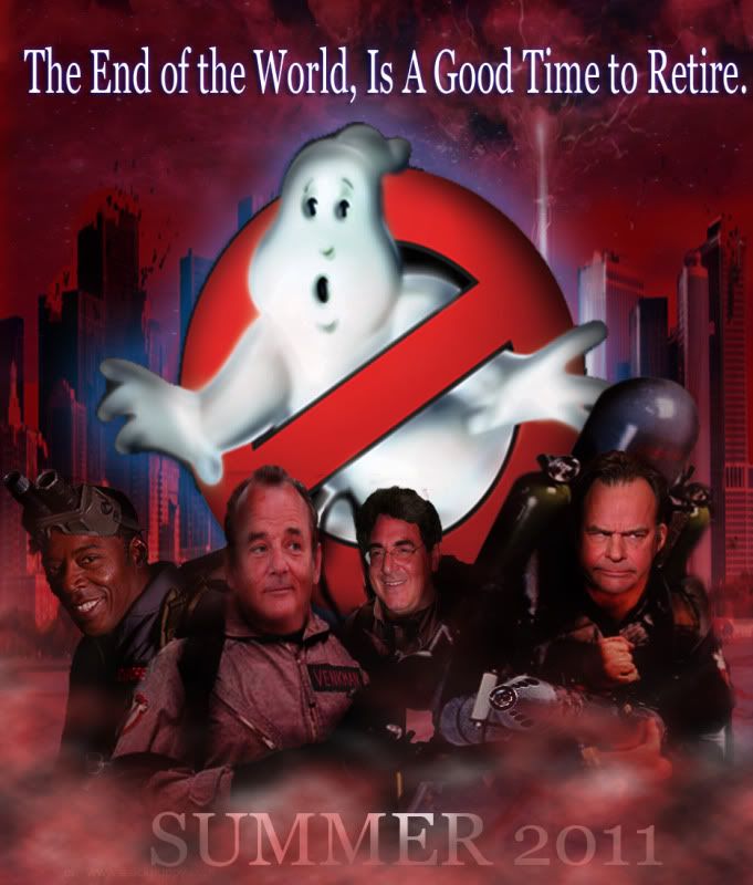
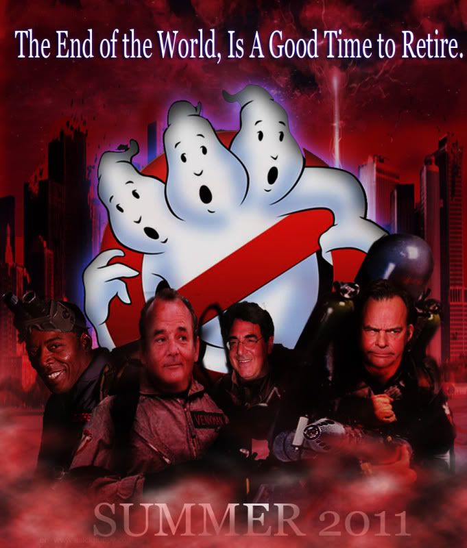
my stab at a GB3 POSTER.


by slimer3881

15 years, 6 months ago


Version 1:


Version 2:


by Yehome

15 years, 6 months ago


I laughed at Dan's face.

by Kingpin

15 years, 6 months ago


It would've been better if the logos and backgrounds had been specifically created, rather than borrowed from others' work.

by AyameEx_Goddess

15 years, 6 months ago


Winston and Egon seem pretty happy considering it's the apocalypse and all.

Wait, I know. Must've been pudding day at the old folks home.

by Nix

15 years, 6 months ago


Your second attempt reminds me of the Three-Headed Knight from Monty Python and the Holy Grail.

EDIT: And what's with the Richard Nixon-esque Ray Stantz?

by ajquick1

15 years, 6 months ago


I'd see it!

by ghostbusters2131

15 years, 6 months ago


Kingpin;142885
It would've been better if the logos and backgrounds had been specifically created, rather than borrowed from others' work.

Oh come on, Ben, it´s a funny amateur attempt… but I could design a new logo for the GB3.

by slimer3881

15 years, 6 months ago


lol, yeah Ben, no need to be critical, its not meant to be a masterpeice, but just having fun with photoshop, nothing special.

but on the topic, if the 3rd movie were to get made, my best geuss would be that they would have an updated original logo for promo material.

by Kingpin

15 years, 6 months ago


Oh, trust me, if I was being critical you'd know it. The above was just offering honest feedback.

by fusi0n1

15 years, 6 months ago


I thought they were great Slimer.

My only comment would be to split the top line, it's a bit too long for a tag line.

Maybe along the top have:
“The end of the world…”

Then underneath the logo / picture:
“A good time to retire”


Would love to go into the cinema one day and see the original logo on a black background. Or even a slightly modified version of the original to instantly signify a third instalment.