Return of the old board's GBIII poster guy


by fixer791

17 years, 9 months ago


Hiya guys,

Some of you might remember me from the old board as the ‘poster guy’.
Five years ago, I made a Ghostbusters III poster and I was pretty blown away with the way it’s been appreciated over the years. For those of you who don’t know what the heck I’m talking about, it’s this one right here:

http://www.deviantart.com/deviation/1153040/?qo=28&q=by%3Afixer79&qh=sort%3Atime+-in%3Ascraps

Loads of Ghostbuster-fans contacted me about it to show appreciation or to ask if they could use the poster or its logo for personal use as car-decals, poster-size prints, banners or T-shirts. That wasn’t a problem at all for me, of course… I was truly honored by the positive response. Some of the nicest Ghostheads even sent me pictures of them standing in front of their printed version on the wall or sporting their GBIII T-shirt.
Also, a lot of people even wrote me to say that when a Ghostbusters III movie would actually be made, they thought Sony should use my logo for it. Some even added that I should send it to Sony or Aykroyd.
That truly was the biggest compliment I could get

Y’know, I’ve made quite a lot of similar teaser posters for fictional returns of beloved cultural icons before the GBIII poster and after…
Well, I must say I never had as many positive and heartwarming responds with those as with my GB one.
I guess it shows that Ghostbuster-fans are truly the sweetest bunch of fans around…
Either that, or my other poster designs were rubbish

Anyway… The reason I start this thread is this…
Thing is that when I made it all those years ago, I was still in animation school and had just begun using Photoshop… Because of this, a few things could’ve been done better… Those flaws really started to bug me over the years. They’re all details, but fact is that when I’d make a poster like that today, I feel it would be better.

That’s why recently, I’ve been thinking about giving my GBIII poster a serious revamp.
I told this to my girlfriend and she asked me why I shouldn’t make a different GBIII poster altogether. Maybe that isn’t a bad idea either…
Fact is that I still have quite a lot of old, unused GB poster sketches lying around. Also, after she told me that, I’ve started doodling a few new ideas on paper. Just to see what I would come up with now… So I guess I could make a brand-new one…

Both have pros and cons for me, so I wonder what you guys ‘n gals think…
What would you prefer to see? The old one remastered or a completely new one?
by heslimedme251

17 years, 9 months ago


Well as is evident with my signature picture, i loved the logo you created! so i'd love to see what you could do to the thing to make it better! and i'd also love to see what else you can come up with! so both would be my option…remake and new! why not? heh.

-J.

by fome

17 years, 9 months ago


cpc

by Sayingkingkilla

17 years, 9 months ago


Agree. I love your poster. It's a very cool teaser. Great to see you're interested in another. Revamping it would be cool but I'd like to see one without them as silhouettes, so I'd go with a new one but with that very cool logo. Can't wait to see it, no matter which you decide to do!

Btw, I've always wondered who's who in that poster. From left to right, I guess. Winston, Ray, Egon, Venkman. What's the right order?

by fixer791

17 years, 9 months ago


Thanks y'guys

Y'know… I told my girlfriend last night that I'd put this thread on the board. She still thought I'd better do a new one, so we discussed the rough designs I already have.
In fact I just wanted to eliminate a few possibilities and narrow them down to the best idea for a new poster, in case I'd really make a new one.
Instead of narrowing down what I already have, she gave me a couple of new ideas. Sadly, they were all good, so that doesn't make it easier

Anyway…
You're almost correct, King… The right order on the old poster is this: Zeddemore, Stantz, Venkman and Spengler.
Then, if you realy squeeze your eyes, you can also see mr. StayPuft in the background…
(*_*)

by Sayingkingkilla

17 years, 9 months ago


Whoa whoa whoa, I never noticed that before. I see him now! Right behind Egon. But how long did that poster take to do?

Wondering if you'll show us some of your concept art, is that asking too much :p

btw, in my previous post, I meant a poster with them not in silhouette, I said it wrong.

by fixer791

17 years, 9 months ago


Sayingkingkilla
Whoa whoa whoa, I never noticed that before. I see him now! Right behind Egon. But how long did that poster take to do?

Wondering if you'll show us some of your concept art, is that asking too much :p

btw, in my previous post, I meant a poster with them not in silhouette, I said it wrong.

Don't worry, most people didn't see mr. Stay Puft. I just put him in there as an easter egg :p

As for how long it took me to make it… I really don't remember. It's too long ago. I do remember that it took pretty long, especially the beams.
Like I said, I'd only just begun working with Photoshop, so I didn't really know what effects or filters to use to make them look OK. It was a bit of trail and error until they looked good.

Of course I'm willing to show you some design sketches! Of course, I'll only show abandoned designs. Wouldn't want to take away the surprise in the case I'd make a new poster
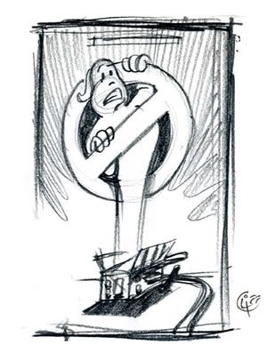
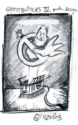
Here ya go:


Both are rough pencil sketches made in January of 2003.
The reason I'll never use this idea is this…

Shortly after I did the GBIII poster, I really wanted to make this design into a poster for GBIV. Of course, I needed a photorealistic image of a trap for this.
I contacted a prop replica site where I'd seen a lot of good images of fan-created traps, explained who I was and asked permission to use one of their trap pictures to base the poster upon.
Sadly, the answer was ‘no’… Never quite understood that…I was quite disappointed by this. So much so that I abandoned the GBIV poster project altogether.

Pretty recently, I stumbled on this French website:

http://deff.echosblogs.org/

If you scroll down, just above my GBIII poster (how the hell did that get up there?), you'll find a poster someone did also featuring the No-Ghost logo being sucked into a trap. Pretty much like the one I wanted to make, except that he used the GBII logo with another finger up.

That's why in case I'd make a new poster, I'd rather not use the ‘logo into trap’ idea… Wouldn't want people going “Hey, I've seen THAT before” …


Some of you might recognize the reaching out No Ghost logo from the first picture… I used an inked and colored version of it for a while as avatar. I originally made it for a GB website whose webmaster asked me for it and ultimately never used it on the site. Never know why either…
Anyway, I ended up using it as an avatar.
It also ended up on the back of an Ecto 1 model. It can be seen on the same French website whose link I put above.
Anyone know if it's a real car replica or a 3D model? Has anyone seen it before? Just curious…

Anyway… As soon as I have other designs I'm sure I won't use, I'll certainly show them to you if you guys are interested in seeing 'em.

by Kingpin

17 years, 9 months ago


The model was part of ‘Ghostbusters: The Next Generation’ which is, as far as I'm aware still stuck in production.

I remember you mentioning the inclusion of Stay Puft in the background back during one of the first times someone had stolen it to sell on T-Shirts, Cliff… still bugs me when that happens.

I of course am greedy, and would love to see a revamp and a whole new design, but that's me. Shame you've decided agaist the Trap angle (Although I can sympathise to why) as there's good photo reference of the Traps from the DVDs now.

I look forward to seeing what you make, though… one more original new GB logo design and one less person using that ‘three finger’ varient of the GBII logo, the better.

by Ectoman57

17 years, 9 months ago


I havent seen your poster in about 4 years, wow, i googled gb3 and sawe it and i never could find it again. i hope u didnt mind but i took your ghost and used it to create my own logo, i never found out who made it until now:


by fusi0n1

17 years, 9 months ago


While this isn't exactly helpful, I think whichever design route you choose it will turn out great.

Do the sketches as you said, explore both a totally new direction, and a revamp of your existing one. And see what works. That way you're not limiting your imagination.