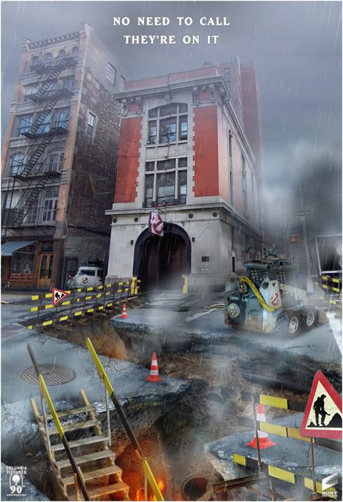
Return of the old board's GBIII poster guy


by fixer791

17 years, 8 months ago


Kingpin
On a different note… that the dark blue uniform seen in the montage of Ghostbusters II?

I think it was, yeah…
During the Q&A, Hudson mentioned he got to keep the costume…
I wonder if he was joking or not…
I wonder if the costume he wore in Holland was the real deal used in the movie or just some replica…

Anyway…
Didn't know Hudson will be back in Holland in May, Rob…
Is it back in Rijswijk or somewhere else?

In any case… Maybe I'll be able to give Ernie my new poster then

by heslimedme251

17 years ago


Sorry for necroposting somewhat, but I just wanted to bring a potential plagarism incident to fixer79's attention!

www.smokefreeherts.org.uk

As i'm unsure wether they've asked permission and it ticks me off when people plagarise other peoples work! Just putting it out there for someone to check up on! (If it really matters!)

by Kingpin

17 years ago


Good catch, heslimedme, I'll send Fixer a note over to his DA account so he should see it pretty quickly.

by fusi0n1

17 years ago


Yeah great cause aimed at kids.

But yeah permission is always good. I love how they've used the Spider-Man poster, I'm not too sure how Sony would feel about that.

Also that's really funny. I saw the Superman pic and first thought it was Captain Hero from Drawn Together haha.

by fixer791

17 years ago


Hi guys!

First of all, thanks for your concern and for letting me know
Well spotted, by the way, Heslimedme! Boy, you're alert aren't you?

Anyway, to answer Heslimedme's question…
Nope, they haven't asked me permission to use or change the GBIII logo.

It would've been nice if they would have, but hey…
At least they're using it for a good cause! There's no commercial gain involved or anything.
Unlike that dang-blasted piece of scum who ripped the entire GBIII poster and sold it on a T-shirt on Ebay!
Now THAT was something else! :-@

In fact I'm also rather proud that these guys used my GB design…
I mean… they used the real Spider-Man poster, Bruce Timm's Superman art and art from the 60's Batman show…all official stuff.
And then they choose to use my Ghostbusters logo over the official one…

Also, I remember this sort of Smokebusters campaign around my school's playground back in the eighties … Their logo was a modified version of the real GB logo…
Now, it seems like the Smokebusters are back, and they choose my design for their revamped logo…
Yeah, that makes me kinda proud

Thanks again for your support and concern, lads!
You guys are great!

cheers,

Cliff

PS: In fact I really should start listening to these ‘stop smoking’ campaigns… (*ray)

by WEBUMPBACK

16 years, 7 months ago


SERIOUSLY, how awesome a bloke is Ernie Hudson!!

by Kingpin

16 years, 7 months ago


Not too sure why you necroposted a topic that hadn't been updated in four months.

by WEBUMPBACK

16 years, 7 months ago


Necroposted? Ummmm, I dunno maybe because it's a messageboard and as human beings we shouldn't have to live our lives existing in a giant filing cabinet. Loosen up, buddy! It's a party!!

by fixer791

15 years, 7 months ago


Hey you guys,

I finally finished my new Ghostbusters III poster. Took me quite a while.
Actually, I had made several idea sketches ages ago. Ultimately, I chose the one I liked best and started to work on it two years ago (can't believe it's been that long).
I've been working on it once in a while in my spare time since then but now it's finally done…
Note a new addition to the Ghostbusters vehicle family, the ECTO loader.

I've also made a quick teaser poster. Even though it's basically just a cropped version of the logo with a ‘3’, I kinda liked the idea. It reminded me of one of my favourite posters, the Batman Returns teaser, which was just a close-up of the logo's head and the word ‘returns’ and the month of its release. It's one of the most striking and effective posters I've seen so for, hence my little Ghostbusters homage to it.

Anyhoo, I hope you guys like 'em!


See you ‘round,

Cliff

PS: You can see a larger version of the ’No need to call' poster here:
http://fixer79.deviantart.com/art/Ghostbusters-III-poster-B-116968152

by doctorvenkman1

15 years, 7 months ago


I really like the “teaser” poster, and what you were able to do with that. In fact, I'd like to see something like that in a theatre, I think it would look great.

As for the other one… it seems a little odd to me. Where Ecto-1 is parked… the steps down into Hell is kinda too cheesy for me… the “Ecto-loader” is just weird… The poster suggests that Hell is actually right beneath the Earth's crust, with steps and a hole being dug down to Hell… Just too odd for me… I really like the tagline, though. And the poster is very high quality, looks professional.